A good looking signature not only has an awesome looking profile photo and banners but also contains other minute aspects. They stay in the background but play a very important part in getting your signature noticed. The aspect what we are talking about is colors. Yes! you’ve heard it right. One normally does not bother too much about what shades to choose and what not. But colors make a layout attractive. Imagine having all black or complete white. It is perceived as neutral or even dull. On the other hand if something has a color added to it, it immediately comes to life. Having said this, its also important to choose the right colors from the palette. A simple wrong move and you will repent it forever. Primary colors are red, blue and green and their combinations. Pastel colors have hues and have comparatively lighter tones than primary colors as they are mixed with white. They have a softening and calming effect on the mind and impart a relaxing effect. For your email signatures, you need to make use of pastel colors, since primary colors tend to cause discomfort to the eyes. An example for a primary color is bright yellow. They might look excellent on a shopping banner but on an email signature it must be avoided. Also, there are warm and cool colors. Any color which is derived from the sun is a warm color. Hues of yellow, orange and red are warm. Blue, purple, cyan are examples for cool colors. In this article we shall look at some of the guidelines to follow when choosing colors for your email signature.
Before plunging into the tips for using colors, let us understand the meanings that colors convey.
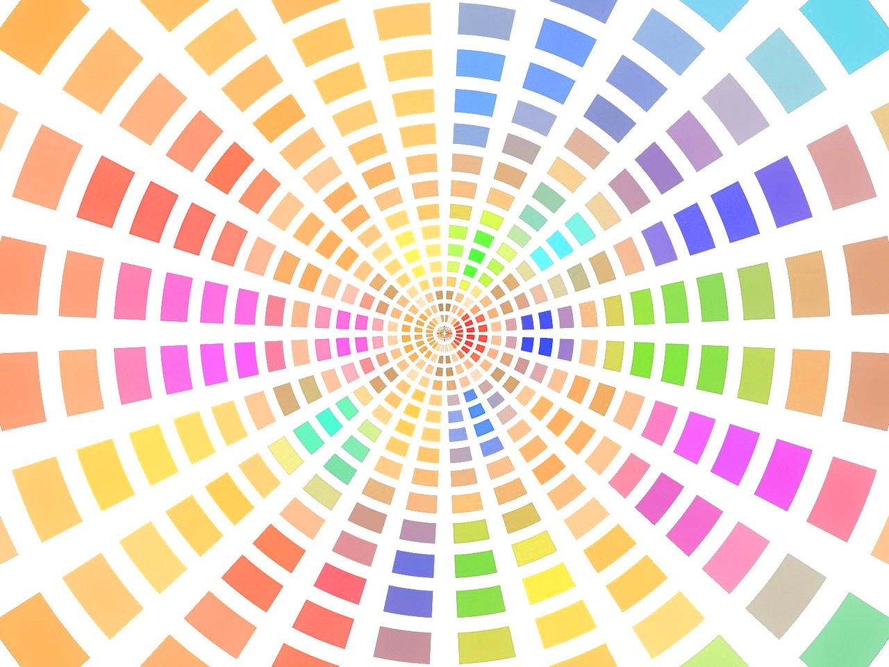
The color yellow depicts sunlight and usually associated with brightness. It is one of the warm colors and also represents caution used in signboards. Yellow color is used for taxis, placards on supermarkets, for big banner backgrounds etc and represents energy and charge.
The color blue and sapphire represents flowing or movement and is one of the cold colors. It is suited for marketing water related equipments and products. Blue is also the color which tends to have a calming effect on the mind as it is usually associated with sky, water, ocean and breeze.
Red is the color which signifies danger, passion and love, but it also one of the most commonly used colors to grab the attention. It is usually seen on discount banners and hoardings, during Christmas, Valentines day etc.
The color green commonly goes with trees, fertility and growth. Green is also a symbol for good health and to denote something is right or secure. Green color is often used in security related products, health care services and medicines. Similar to blue, green creates a calming ambience on the viewers.
The color pink is usually tagged with feminism. But it cannot be gender stereotyped as it suits equally for both males and females when correctly implemented.

Now that we have understood the colors in general, let us dive deep into the do’s and don’t’s of the color jargon.
- Avoid bright colors at all costs : Bright colors have a peculiar glare and intensity which obstruct the vision. Not only they are harsh on the eyes but also take away the focus. Usually referred to as neon colors. they outshine during the pomp color festivals but on an email signature they look hilarious as if your child messed up the color palette.
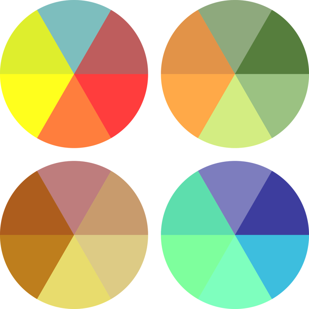
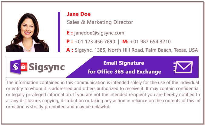
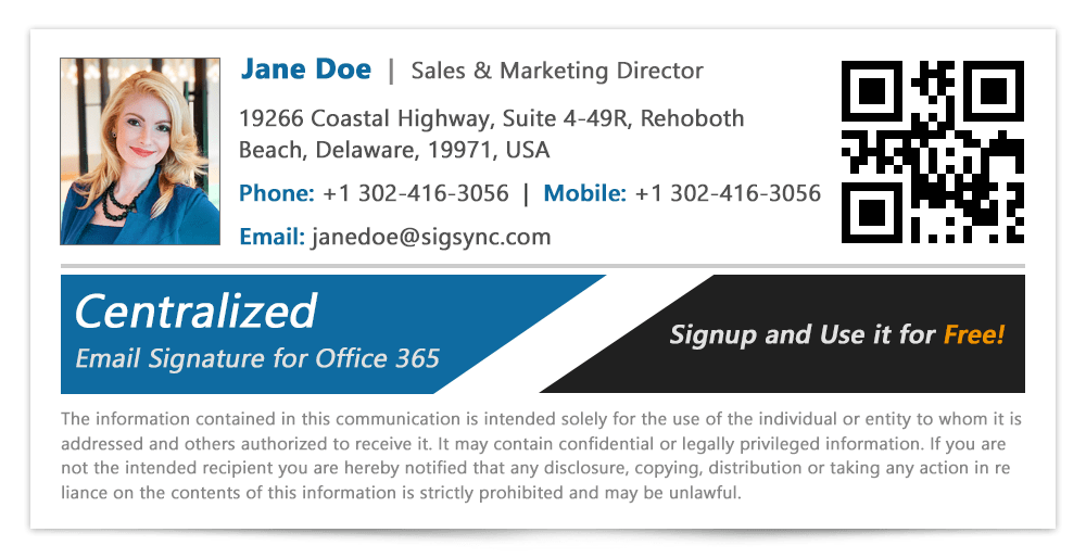
- Make use of complementary colors : They are the colors which complement each other in the color wheel. For example red with blue, yellow and purple etc. The trick here is to not use too many complementary colors. Stick with only two and you can try different combinations between those as shown.
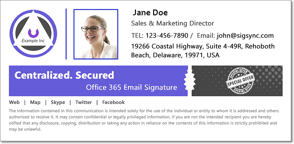
- Email signature text must complement with the background: This is a basic fact that any text must be readable. To make it decipherable, preferably use a dark color like black or maroon against a light background. If you are planning to use light colored text, make sure you use it against a darker background and vice versa. Darker colors are suited for banner backgrounds and lighter colors for your profile image background.
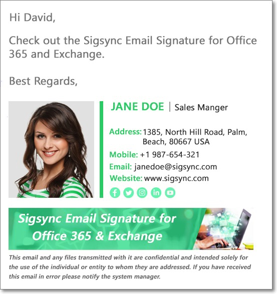
- Match the colors of your outfit with the signature: This is one hidden hack that works wonders. If you are wearing a green coloured apparel in your profile picture, make most of the elements of your signature with hues of green. It really makes your signature an eye catcher.
- Experiment with exquisite and royal colors. Colors like magenta, lavender and shades of turquoise are called royal colors. They are usually associated with luxury items, aristocracy and create an aura of paradise.
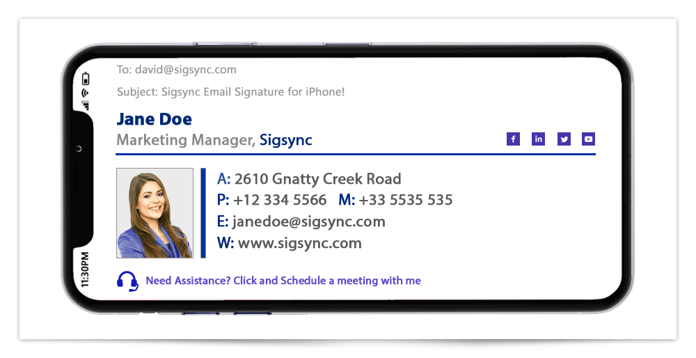
- Check whether the colors look good on other devices. The colors you chose must soften the eyes and look pleasant even on smaller screens like your smartphone. It is better to test how your signature looks like, not only on desktop devices but even on others.

Conclusion :
Colors are very important in your email signature and can significantly affect business and marketing responses. A recipient perceives the color first and becomes inquisitive about the content later. Splashing too many colors is also not advisable unless you want to tweak your abstract hobby ideas. Avoid very light shades for the text. Changing the colors to suit the seasons also adds dynamism to your signature and does not make it look outdated.
If you are looking for a stress-free way to create centralized, company-wide and professionally looking Office 365 e-mail signatures, then you are at the right place.
Sigsync for Office 365 Email signature
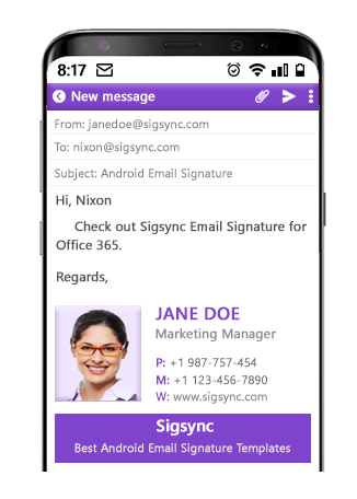
Sigsync is a cloud based Office 365 signature service with variety of customized templates to choose from and maintains your corporate identity across the entire organization in a single place. What’s more, it offers a free trial to test all the features to your heart’s content. Our 24/7 customer support will be more than happy to lend you a helping hand. You can even try out different fonts on your signature and preview them before using it. More information about this excellent signature service can be found visiting https://www.sigsync.com

