Designing the perfect email signature is no child’s play. Getting the perfect image, signature layout to the right colors is a back-breaking task in itself. To top it all, one needs to carefully choose the right fonts to make the entire signature look appealing. As we can rightly say, the pen is mightier than the sword, words and writing style convey a greater meaning than all the exquisite bells and whistles your product has to offer. It goes by the saying, all show and no substance if you don’t use the right type of fonts. It is also very important to select the correct fonts or web-safe fonts as they are displayed universally without any issues. Improper fonts might look garbled on a smart-phone screen or devices might simply fail to support causing distortions. This leaves a bad impression on the recipient viewing your mail. Exercise caution and make sure not to use fancy fonts. They might look great on a story-book but sadly not on your email signature. Before sending the emails to users, it is always a wise idea to send a test email to yourself. This way, you can be convinced that the font looks fabulous when you actually send the email. Back in the days, letters used to be handwritten and it used to be an arduous venture to decode the text if composed with a poor handwriting. But with improved technology, it is now possible to change the lettering with the click of a mouse button digitally. The size of the fonts also play a very vital role. If you choose the right font but forget to customize the size, everything goes in vain. Small fonts are hard to catch and comprehend. Big sized fonts give the message of something being too loud, neither of which grabs the attention. In this article, let us look at some of the tips to stylize your signature using crisp lettering.
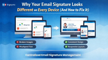
Email Signature Management
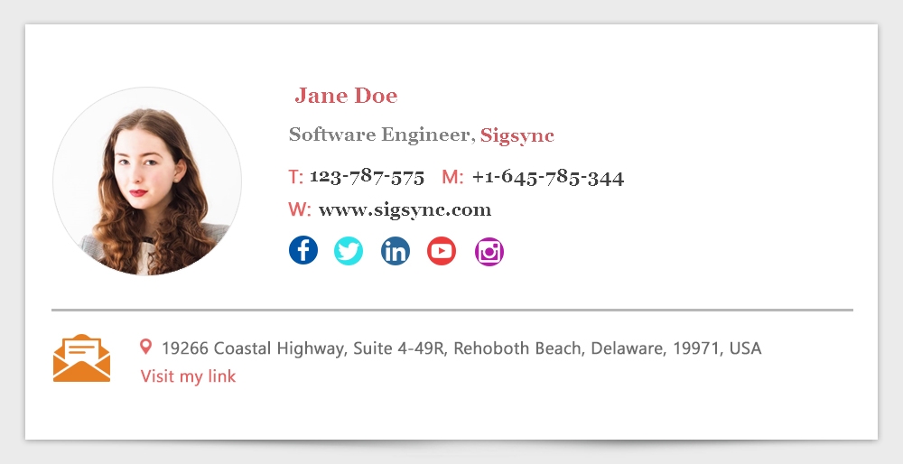
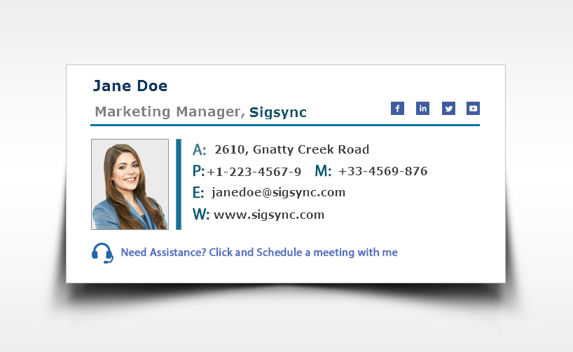
Sigsync Email Signature manager for Office 365 is a cloud-based software that lets you create and centrally managed email signatures and disclaimers for all users in your Office 365 (Microsoft 365) organization.
Before we dive into which fonts suits the best, let us understand some basics about the computer fonts.
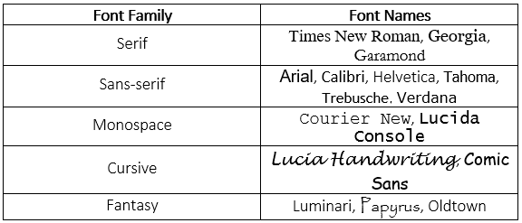
- Serif fonts : They have pointed strokes at the end of each letter and give a feel of elegance, formality and royalty. Example:Times New Roman.
- Sans-serif fonts : These fonts have pure lines without the sharp and pointed ends of the Serif fonts. They give a feel of modern look and are widely used in web prints. Examples: Arial,Helvetica, Trebusche
- Monospace fonts : These fonts have the same type of lettering for all the words and give a look of the font used in typewriter machines. They have a mechanical look. Example: CourierNew.
- Cursive fonts : They are similar to human handwriting and imitate calligraphy. Example: Lucidia Handwriting
- Fantasy fonts : These fonts are primarily used in comic books,decorative articles, movie banners and are usually not suited for email signatures. Example: Papyrus.
- Arial: It is the default font for most of the print and web screens. It has clear letters which any person can read. Font size can range between 10-14 depending upon how it is displayed. The name and designation should have a slightly bigger font when compared to the rest.
- Calibri: Calibri has a much softer and compact edges with a warmer feel. The colors of the font should be light on the eye and should not look very bright or flashy. Avoid using florescent or very light colors at all costs like light yellow, light pink. These are also called neon colors which hurt the eyes. They are better suited as party lights but not in your email signature.

- Georgia: The letters have a rounded edge and they are not as sleek as Times New Roman.
- Tahoma: This is a weighted font, which means that the letters look as if they have some mass. They typically have bolder letters and square shaped dots for the lower-case alphabets and periods.

- Times New Roman: This is one of the ultimate and classic fonts used widely even in applications like Microsoft Word. It is also used in newspapers and called the newspaper font. The letters are stylized and have sharp pointy ends.

- Trebusche: This font is primarily suited for paragraphs, body text etc. The lower-case letters have rounded dots when compared to the square ones.
- Verdana: This font has letters that are thicker and smaller. The letters are also not tall when compared to Times New Roman. This font can also be used for easy reading.
Conclusion: Fonts play a very important role in creating a warm look and feel when the recipient views your signature. Test out the fonts, mix and match before you settle in for the perfect one. You can even ask suggestions from your co-workers or colleagues to find out which suits the best. Using italicized fonts in the signature is again a personal choice and goes with the overall appearance. Your name and designation can be written in Italics. But this does not suit for contact information and website details.
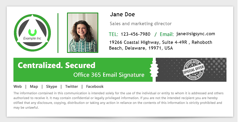
If you are looking for a stress-free way to create centralized, company-wide and professionally looking Office 365 e-mail signatures, then you are at the right place.

Sigsync is a cloud based Office 365 signature service with variety of customized templates to choose from and maintains your corporate identity across the entire organization in a single place. What’s more, it offers a free trial to test all the features to your heart’s content. Our 24/7 customer support will be more than happy to lend you a helping hand. You can even try out different fonts on your signature and preview them before using it. More information about this excellent signature service can be found visiting : https://www.sigsync.com