
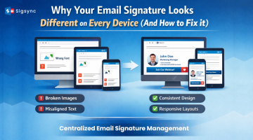
While sending any emails you need to be aware that most of the people use mobiles or tablets to view the emails. Therefore, you need to take this into consideration during the creation of emails. Have a mobile-friendly approach while designing to ensure better user experience in small screens.
Create a design where users should not have to zoom in and zoom out emails to view the content. Navigation should be made very simple and at the end, even mobile users whom you are sending emails should have the best experience. Here are some tips to make your email mobile-friendly:
Usage of single-column template:
If you are using multiple columns in emails it appears as compressed and makes the navigation quite difficult. But the single column template is compatible in multiple devices and it can easily be viewed in different email clients as well. It also simplifies the design and highlights the most important content.
Large font size:
Make sure to have larger font size in order to make the email more readable in small screens. Because if you are using small fonts on desktop then it’ll be even smaller in mobile devices. Therefore, it’s better to have larger font size which helps your users to read your emails in both mobile and desktops.
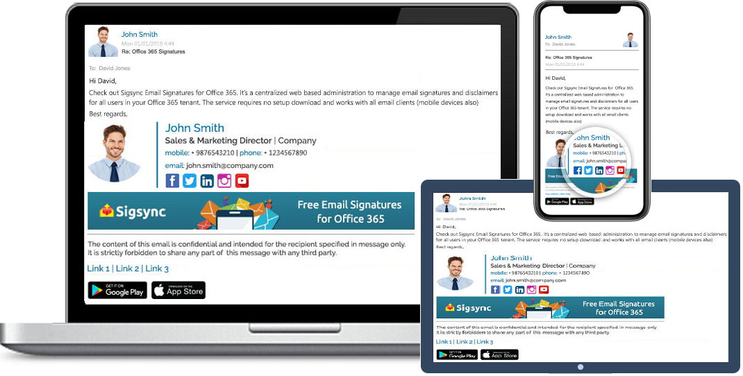
Free Office 365 Email Signature
Free Office 365 Email Signatures manager allows you to centrally manage email signatures.Consistently deliver your brand-compliant Office 365 Email signatures company-wide.Display small images:
Image loading is very important and also most of the users still may use 3g or other slower connections. So, it’s always better to use smaller images which reduces the loading speed and bandwidth. You can also make use of responsive coding techniques to load effectively smaller images on mobile device and larger ones on other devices.
Proper call to action:
Call to action should be provided to guide your recipient what can they do next after viewing the email. Also call to action should be large enough to have an effective view in mobile devices. Display an ideal call to action which has at least 40-pixel square and engage your recipient with your descriptive email.
Keep your subject line short:
The most important line in your email is subject line. If you are using too many words in subject line, it may be viewable in desktop but it’s not completely viewable in mobile devices as it will have less space compared to desktop view. Though some email clients display your entire subject line many do not. Therefore, short and descriptive subject line never miss the opportunity to connect with your clients.