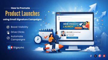
Email signatures have different elements like a profile image, contact details, website address, social media icons etc. These are basically needed to widen your outreach, make your presence felt in the market and make potential customers contact you back. But when it comes to marketing and getting the audience perform specific actions, these elements fall behind. Banners in your email signature capture the attention of the recipients using interactive graphics. They highlight the signature and make the call-to-action very clear. It adds an overall professional touch, catapult marketing activities and creates brand awareness. There might be a scenario when customers do not wish to contact you in person, but would like to know more about a product or exciting deals your company has to offer. Banner elements make this job easier and direct customers to a website, a blog post, a webinar or to a product launch event. This engagement from people also aids in analytics to know what they click, where they head to, what they look at the most etc. For instance, a company which is going to launch the latest model of a smart-phone can include an interactive banner to allow recipients to even book a date for their launch event. Although it is strictly not a sales bash, it attracts people in large numbers. Holiday seasons are also an occasion to use banners, when deals and discounts are touted to be one of the highest. They are cost-effective methods to use, instead of spending money on glittery advertisements that cost a bomb. Heavily loaded banners with gaudy colors are usually not recommended for a banner. They must be kept simple, with a clear cut call-to-action and provide a solution to the users. It should also be specific to the event in hand. You must put yourself in the shoes of a customer and think what you would like to see in a banner element before actually sending it. In this article let us look at some of the tips for designing a banner that imparts an appealing flair.

Free Email Signature generator
Free online HTML Email Signature Generator that helps to create professional and visually compelling email signatures by adding your logo, brand colors, contact details and etc.,
- Match the banner to your brand : If you deal with consumer appliances, the banner color and design should match with the products you market. Association works most of the time as the recipient can easily relate the layout of the banner with the service.
- Use banners specific to the occasion : A banner must transform dynamically with different seasons. For example, if it is New Year, you need to use colors and elements specific to this time of the year. For Halloween, use banners which complement with the autumn shades of the season. These tips make your email signature an outright attention grabber.
- Use banners to communicate with internal employees : During the times of pandemic and emergencies, it becomes difficult to monitor and instruct your employees for specific precautions. Banners can save the day by informing them about useful tips and general guidelines to be followed. It therefore makes communication with your internal employees engaging and interactive.
- Keep the call-to-action (CTA) very specific : A call-to-action is a piece of text aiming to achieve something or attempts to deal with a problem. A banner without a text looks empty and does not direct anywhere. On the other hand, including content like ‘Book a free demo’, ‘Join the latest webinar’, ‘Get your free coupons’ works wonders. Remember to keep it very simple and straight to the point. Long paragraphs in a CTA puts off the reader and deviates the attention.
- Bring in dynamism to your banners : Sending the same banner email to everyone and at all times sounds very monotone and pale. The design must be different for different recipients. For instance, banners to potential investors must not be the same as your client. Banners can also inform people about your social media activities, awards and certifications your company achieved which makes it even more trustworthy.
- Colors of the banner must complement with the other elements : The banner must have the same tones and shades as you have used for others in the signature. For instance, if your profile photo has shades of orange, make sure the banner goes along with it. Dissimilar colors put together, robs away the entire look and appearance. If you are using GIF banners do not make it overly ostentatious. The animation must be user friendly with simple looping.
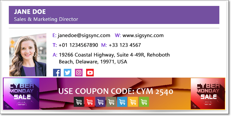


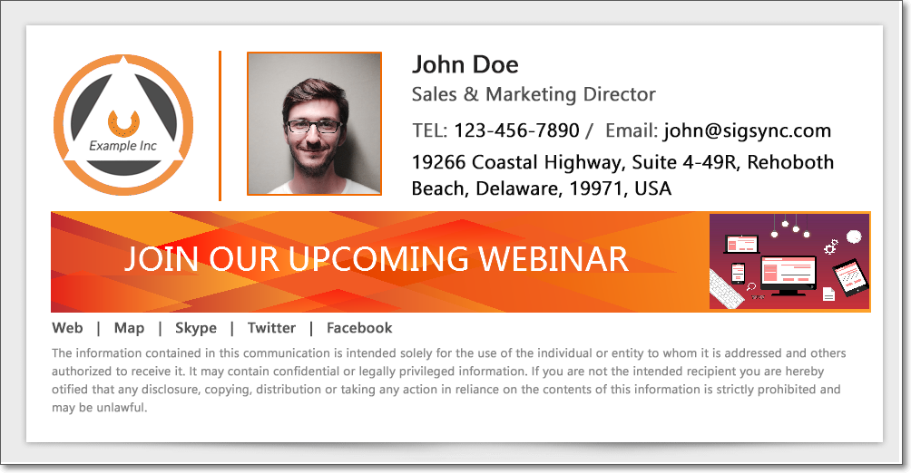


Some general tips for using banners in your Office 365 email signature
- Banners should look simple and clear, never clutter your banner with too much images and information. Your banner should be precise with the information which you want to convey. Also do not make it too flashy. Make use of pleasant color tones.
- You can easily create company-wide email signature banners which don’t appear as attachments and you can modify banners according your teams and departments.
- Direct control over signature content needs to be given to the marketing team for modification or adding new banners. This reduces the load on IT staff.
- While creation of banners you need to keep in mind that it should be innovative and convincing in order to grab the recipient’s attention. You can make your banner stand out by adding fresh content, brand logos etc.,
- Consider the needs of the target audience while promoting banner ads. Making the banner specific to your brand increases its awareness.
Conclusion : Banners can make or break your email signature and they are vital elements of it. A professional banner must be a visual treat to the eyes, should catch the attention of the recipient and must have a clear call-to-action. Promotional banners are also primary sources of marketing and sales. They are used to get more traffic by showing contextual and relevant details about product you are advertising. A receiver skims a greater part of your email and only makes note of your banner if its interesting. Hence its very essential to make it graphical, visual and interactive at the same time
If you are looking for a stress-free way to create centralized, company-wide and professionally looking Office 365 e-mail signatures, then you are at the right place.
Sigsync is a cloud based Office 365 signature service with variety of customized templates to choose from and maintains your corporate identity across the entire organization in a single place. What’s more, it offers a free trial to test all the features to your heart’s content. Our 24/7 customer support will be more than happy to lend you a helping hand if you wish to design interactive banners like the ones above. You can even try out different colors and fonts on your signature and preview them before using it. More information about this excellent signature service can be found visiting : https://www.sigsync.com

